Dashboard
Analysis charts can be saved on the dashboard so that they can be reused and shared easily.
- Setup Dashboards
- Setup Charts
- Send Dashboard as email reports
- Add notes and record actions
Setup Dashboard
The dashboard page can be found in the menu on the left.
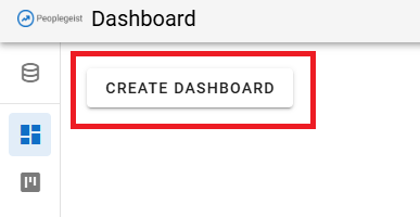
If there is no dashboard yet, a button will be displayed "create dashboard"
Click on it to create the 1st dashboard.
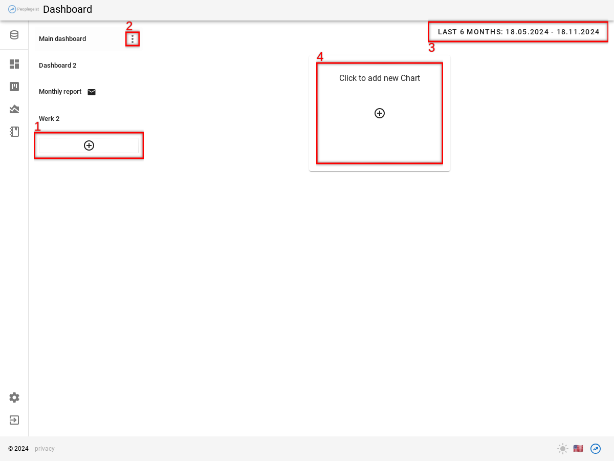
On the left, the existing dashboards are displayed:
- The (1) button can be used to create a new dashboard. Any number of dashboards can be created.
- Renaming, deleting and other functions visible behind the (2) "Menu" button
Click on a dashboard to switch between dashboards.
The dashboards can be sorted via drag-and-drop with the mouse.
3) The date range can be adjusted at the top right.
Setup Charts
Each dashboard can have many charts popular.
Click (4) "Click for New Chart" to add a new chart.
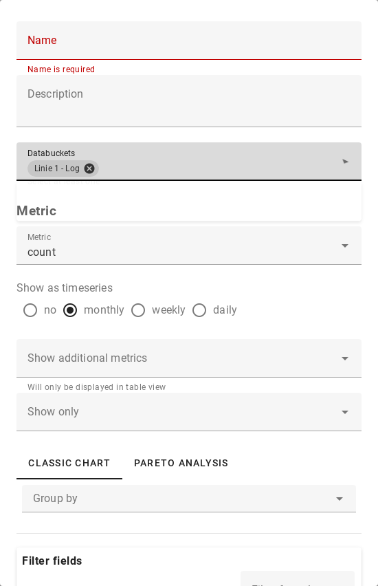
A diagram is defined by:
- Databucket Selection
- Metric: Which metric should be displayed (count, downtime, etc.)
- Timeseries: Display metric as total or as timeseries by week/month/...
- Classic vs Pareto: "Pareto Analysis" are diagrams that show the results of text analysis. Ex. Most common problems, most frequent actions.« "Classic charts" show metrics that could also be created in Excel without text analysis. Example: Count of downtime-incidents per machine.
- Filter fields: Which line, machine, etc. should be displayed. The same filters as in the analysis are available.
After creating a chart, you can edit the charting option.
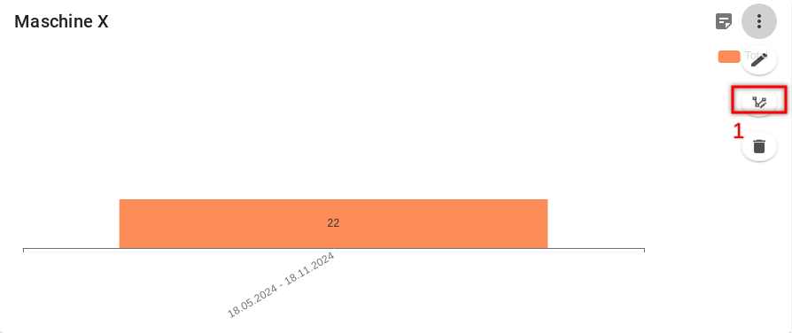
There are
- Bar charts
- Line charts
- Table view
The size can also be adjusted. The sizes refer to "tiles".
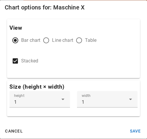
A dashboard is 2 tiles wide and any number of tiles high.
Send dashboard as email reports
Dashboards can be sent by the software as email reports. This is helpful to keep stakeholders or management in the loop of what's happening.
Email Reports can only display tables. All charts must be set to table view.
To activate the email function:
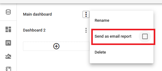
- Open the menu at the dashboard
- 1: Check «Send as email report»
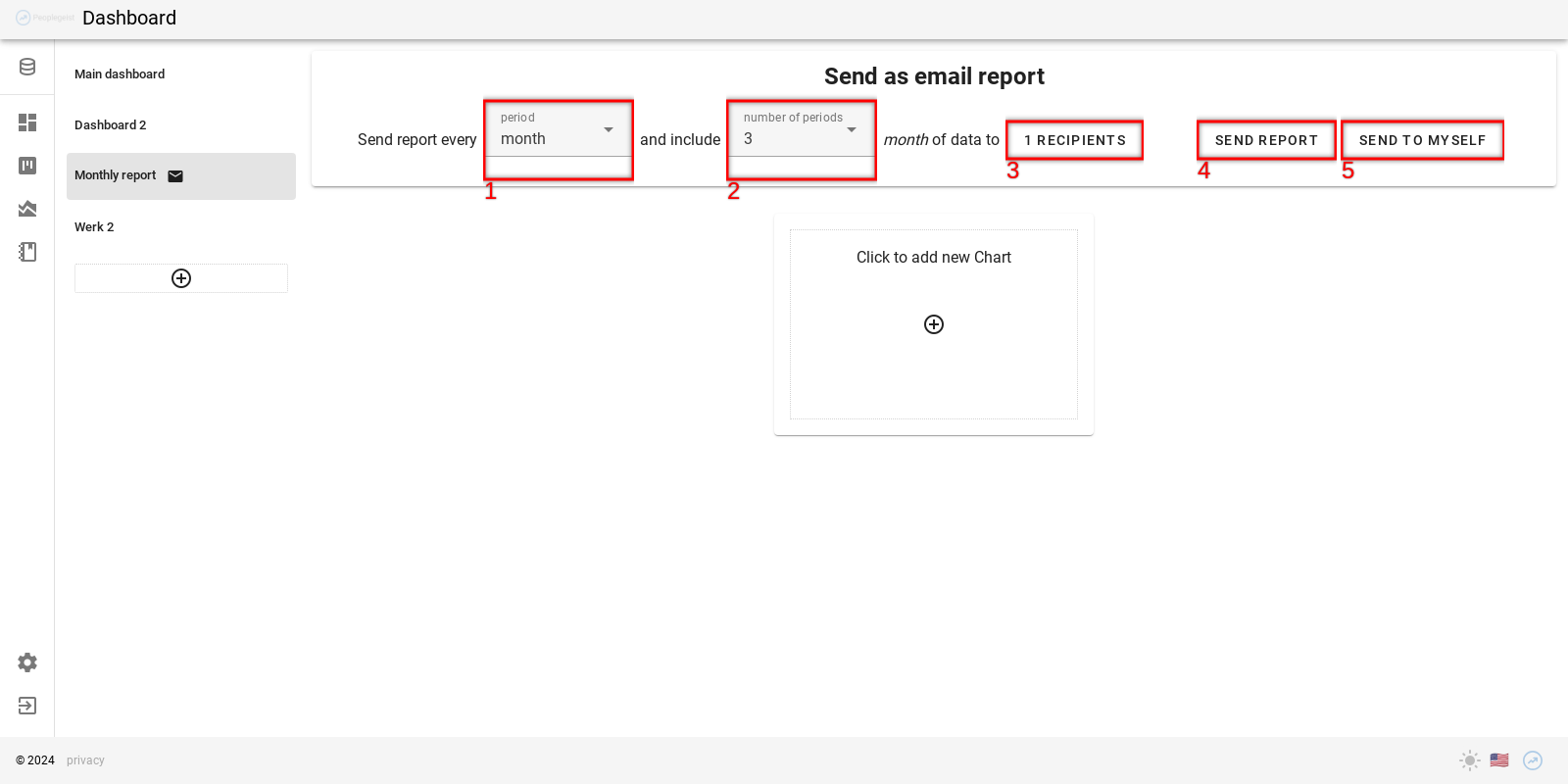
A bar with additional options appears on the dashboard:
- How often the report is sent
- Date range of the report (e.g. the last 3 months)
- Recipients
- Send report: Send the report to all recipients now
- Send the report to yourself (even if you are not on the recipient list). This is helpful as a preview, or if you want to send the report yourself with your own notes.
Add notes and record actions
Notes can be added directly to the chart.
This allows measures and meeting decisions to be recorded.
This also shows which topics are already in the works.
At each meeting, you can go through the notes and update the status.
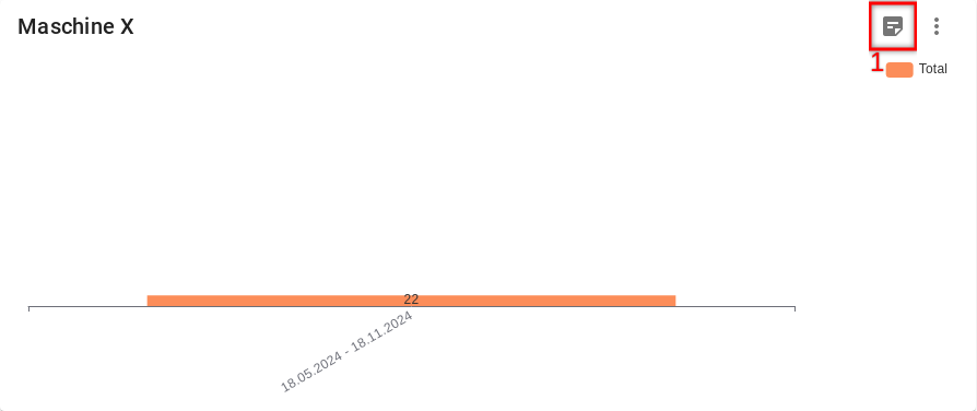
These notes also appear on the Kanban board and can be used there for meetings.