Analyse
Ad-Hoc Analysis of your comments
- Data selection
- Focus machine: Bottleneck
- Automatic potential screening
- Use pareto charts
- Translate / multilingual pareto charts
- Find maintenance tips (preventive maintenance)
- Eliminate repeating errors through root cause tips (Root Cause Analyse)
- Further functions
Data selection
For the analysis, you always have to select the data area to be analyzed first.
An analysis is usually performed per machine.
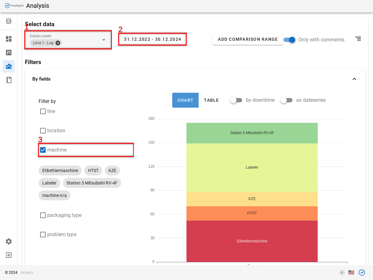
Select the filters:
- Databucket / Line
- Date range
- Filter fields: machine (Depending on the data, additional filter fields might be needed).
The available filter fields depend on the selected databucket and also the selected date range.
If the desired filter fields do not appear, then try to increase the date range.
A chart is displayed as "Preview".
You can click on the diagram directly to select specific "machines".
Focus machine: Bottleneck
As mentioned, the analysis is always performed per per machine.
A good start for the analysis is the bottleneck machine. This is the machine on a line that causes the most downtime, so that the rest/part of the line also stops.
Depending on the line setup, determining the bottleneck is not trivial. In the example here, we assume that all machines in the chain have about the same capacity and that the buffers between the machines are also about the same.
With Peoplegeist Ad-Hoc Analysis you can easily see which machine causes the most disruptions.
Choose:
- Databucket / Line
- Date range
- Filter field: "machine"
On the diagram you can see how the outages are distributed among the machines.
In the example here, the "labeler" makes up the largest share. With a simple line, this is probably the bottleneck.
The graph can also show the "downtimes" by selecting the switch above the chart (4).
This graph can also be saved on the dashboard, so that you can always see the current bottleneck.
Automatic potential screening
This analysis takes place per machine.
The analysis is always performed on a machine level.
To do this, you can go to the "Analysis" page.
Select the filters (see also "Data Selection"):
- Databucket / Linie
- Date range
- Filter-fields: machine
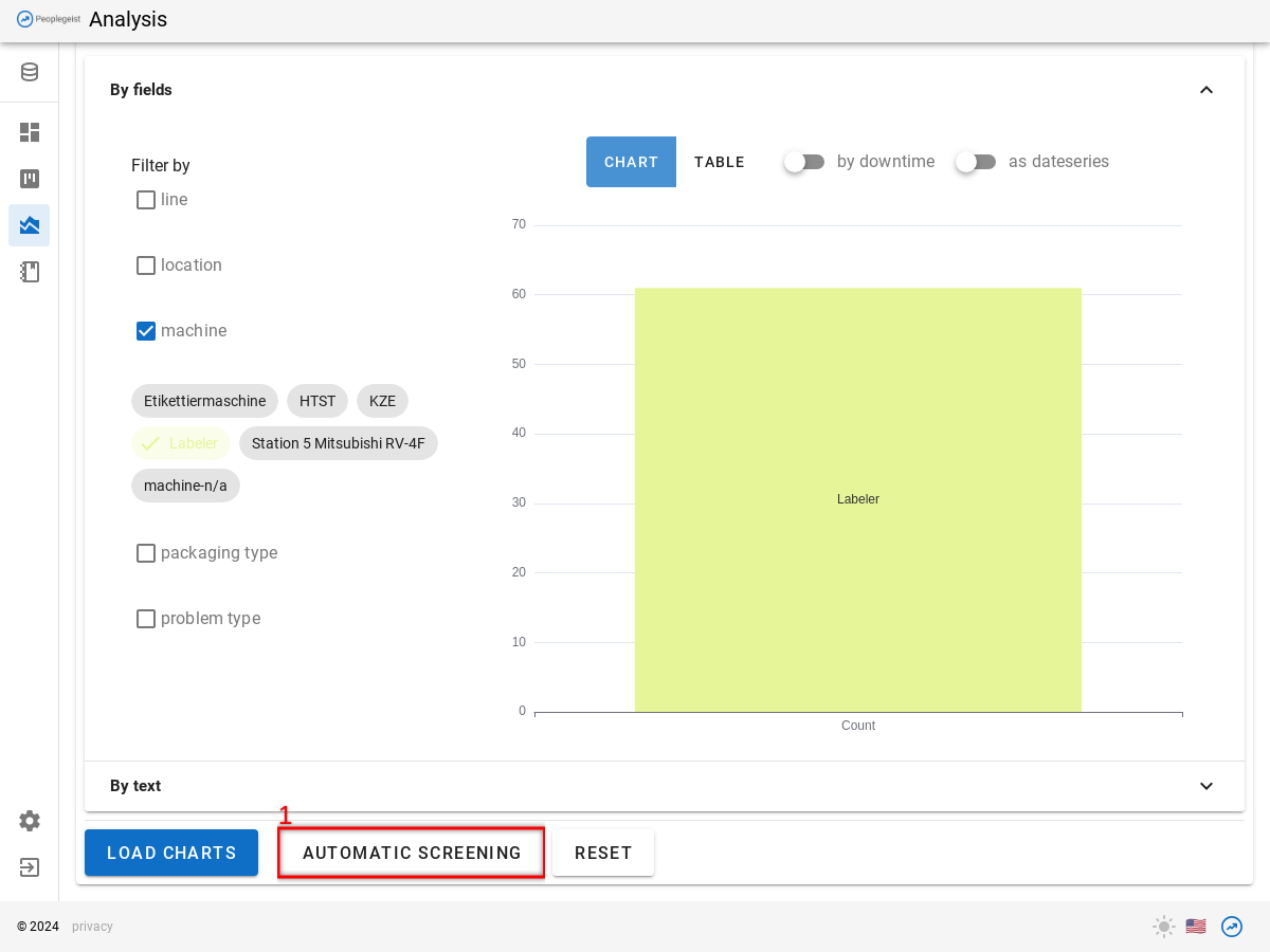
Click 1 «Automatic Screening»
The evaluation takes a few seconds.
Evaluate entire line
You can evaluate an entire line or group of machines in one go.
To do this, deliberativ leave the machine filter empty.
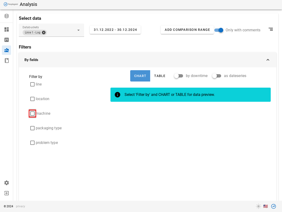
Click on the "Automatic Screening" button.
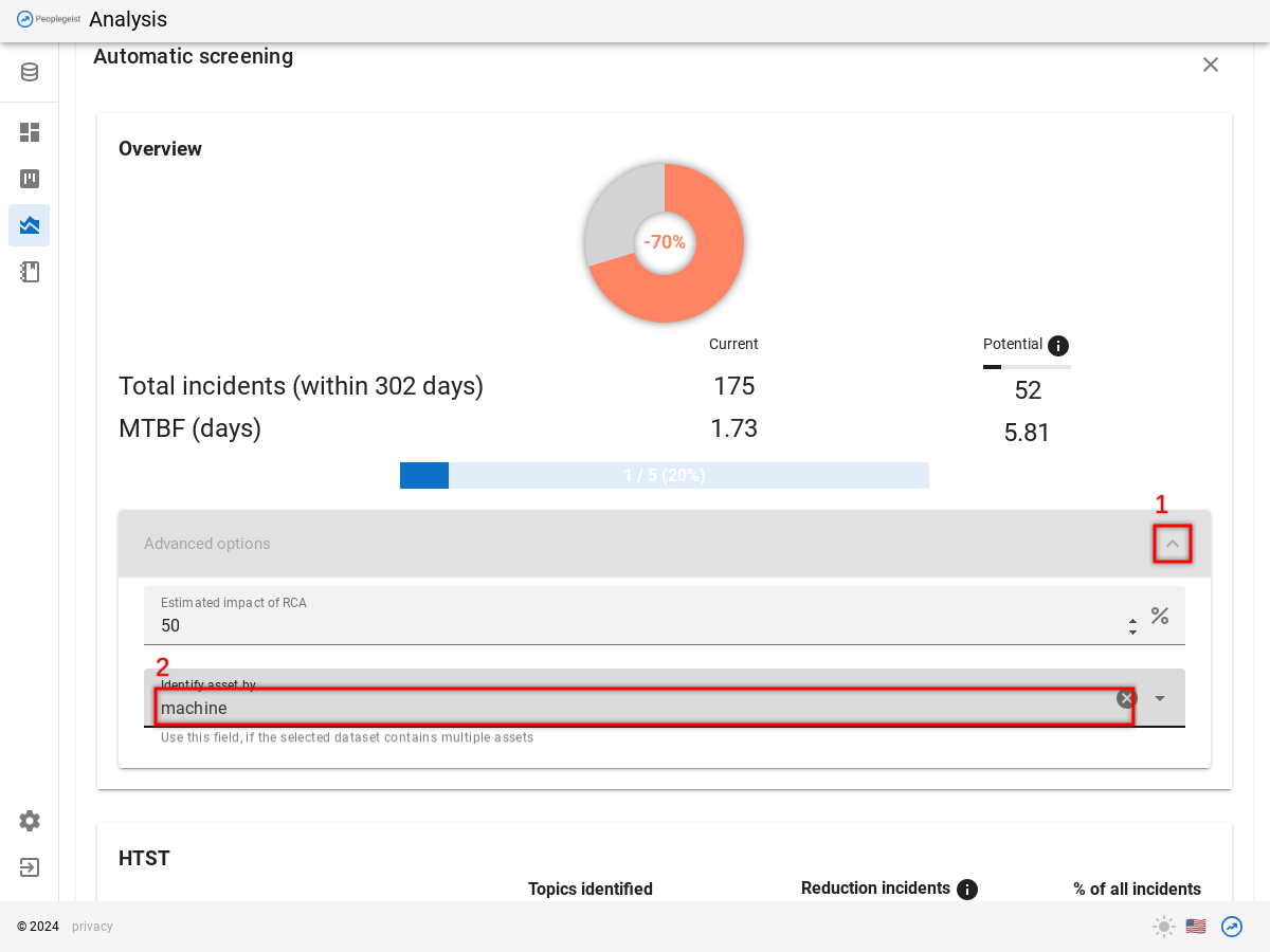
Wait for the analysis to finish, but ignore the output for now. It will not be correct.
- Click on "Advanced Options" (once it becomes clickable)
- Select "Identify asset by".
After that, the evaluation of will updated. A list of the potential per machine will be rendered.
There is an estimate for each machine:
- Stops that could be prevented by preventive maintenance
- Recurring errors that have documented clues to the cause.
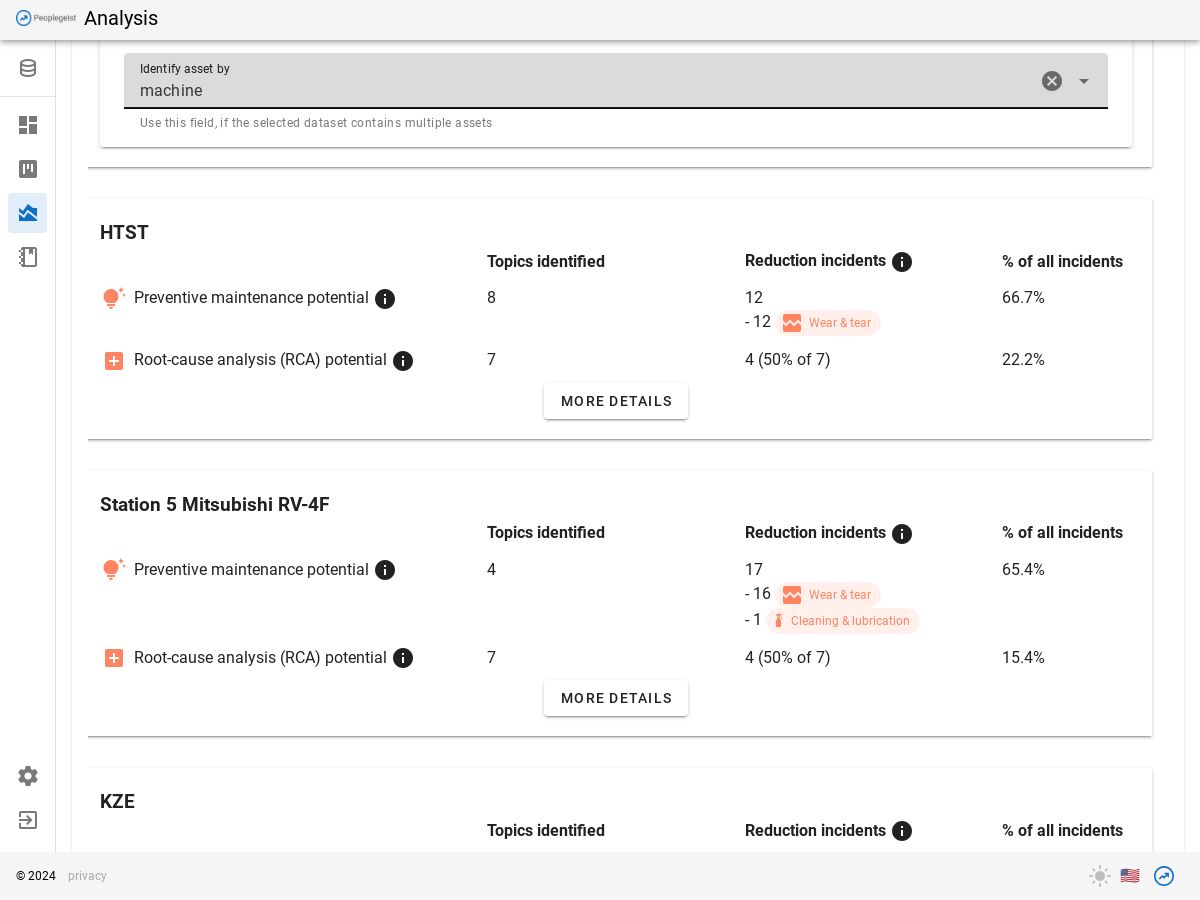
You can adjust in the advanced settings, how much impact RCA projects have (default: 50%).
Use pareto charts
Using automatic screening, you can see how big the potential is to reduce stops through preventive maintenance and through RCA.
The concrete tips can be seen in the Pareto Charts.
To do this, choose as usual:
- databucket
- Date range
- Filter Fields: machine
Click 1 «Load Charts»
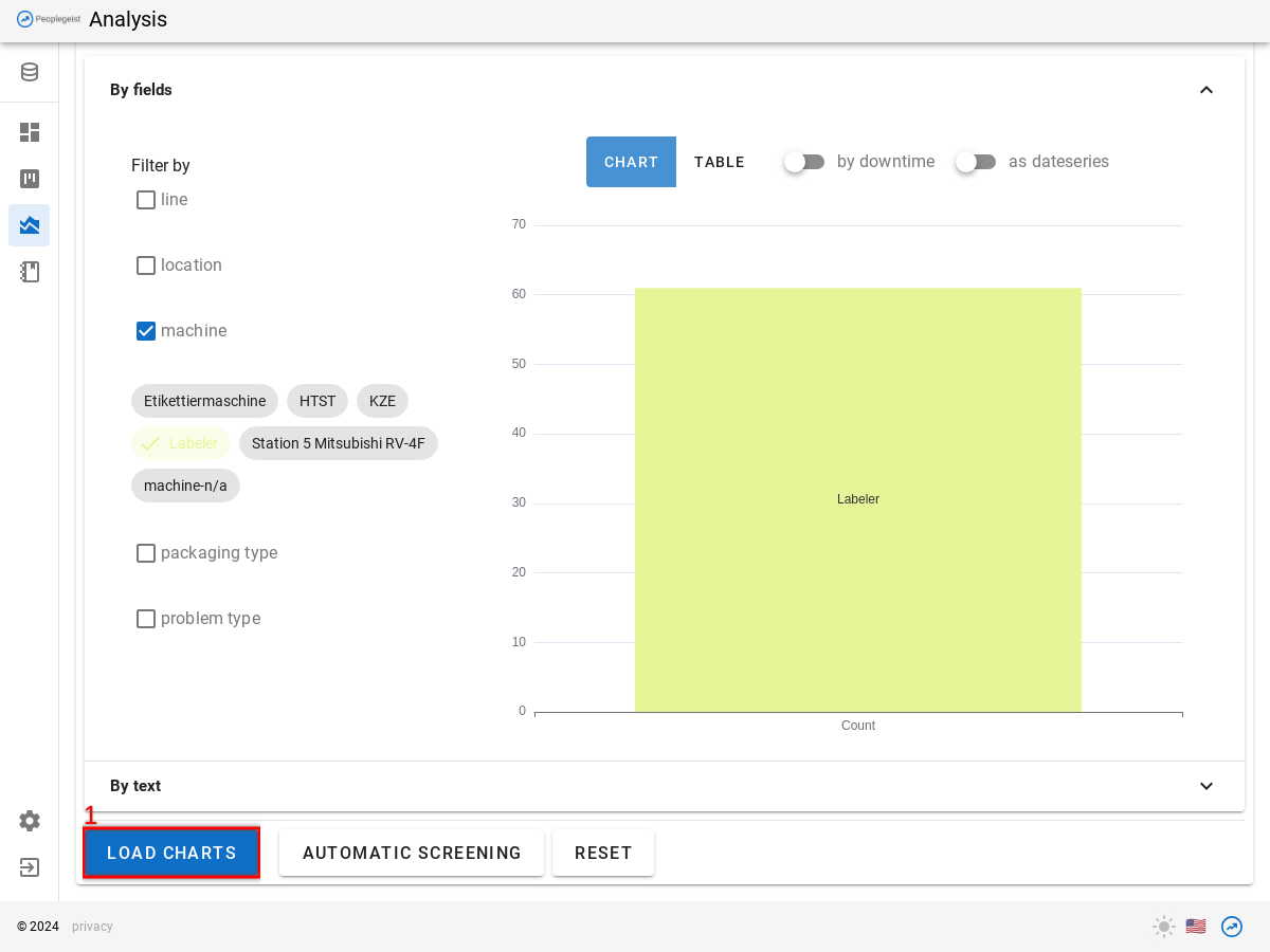
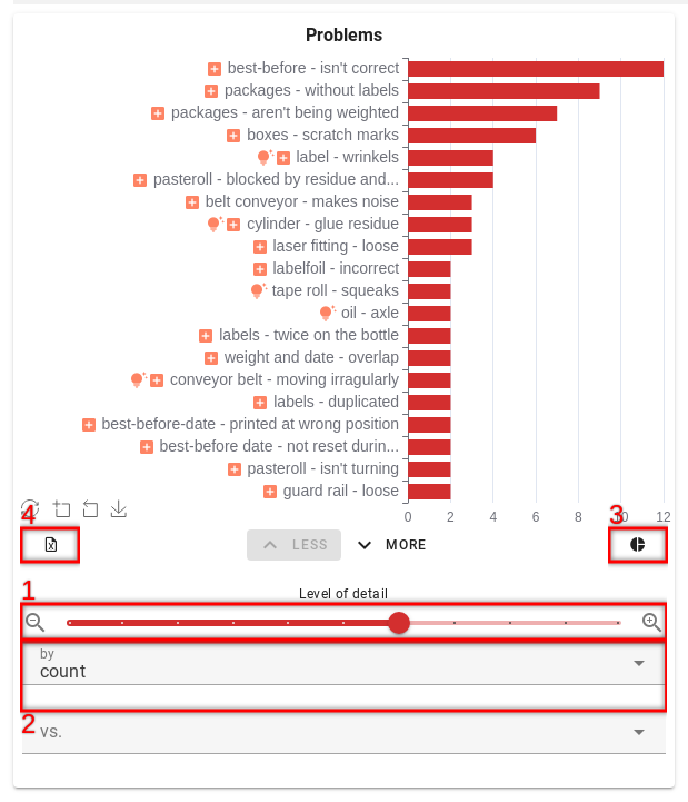
You will see 3 pareto charts
- Red: Problems / Symptoms
- Orange: Actions / Fixes
- Green: Positives
The Pareto Charts show the topics that appear in the texts sorted by frequency.
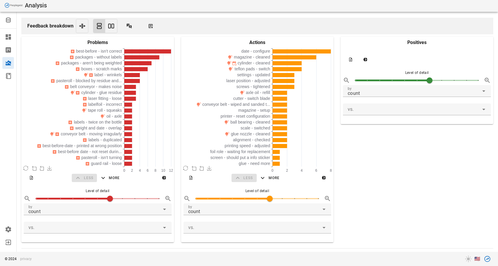
Red: Recurrent problems / symptoms
Here you can see all the problems that are mentioned in the texts.
The most common problem appears at the top. You can see the frequency by the length of the bar.
You can hover over the beams with the mouse to learn more about them.
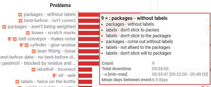
A window will appear. In it you can see the content of the group and a few statistics.
You can click on the topic groups with the mouse. This selects the group.
The selected topics are listed with a "Details" button.
"Details" opens a window that allows a detailed breakdown of the selected topics.
Pareto Charts are a simple and powerful way to prioritize improvement initiatives. It is quickly visible visually where the most production time is lost.
See chapter "Maintenance tips" and "Cause tips" for more details.
Advanced Pareto Functions
- Level: The level of detail of the topic grouping can be adjusted with the "slider". If, for example, a group is to be broken down more precisely, you can move the slider to the right.
- Downtime: The pareto bars can also be displayed by downtime. You can see which topics caused the most time.
- Summary: Overview of how many topics are repeaters
- Export: Export the data to an Excel
Translate / multilingual pareto charts
By default, pareto charts are displayed in the original language of the comments.
You can also view the comments and the pareto charts in other languages.
To do this, first select the desired language.
- Language tool: Multiple languages can be selected.
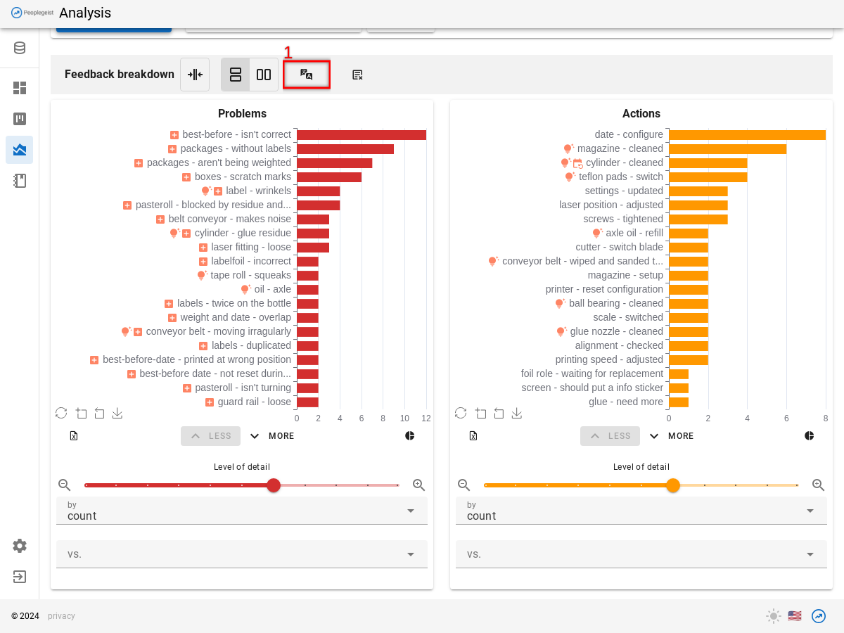
On the Pareto chart, the desired languages are displayed as options.
- Click on the language
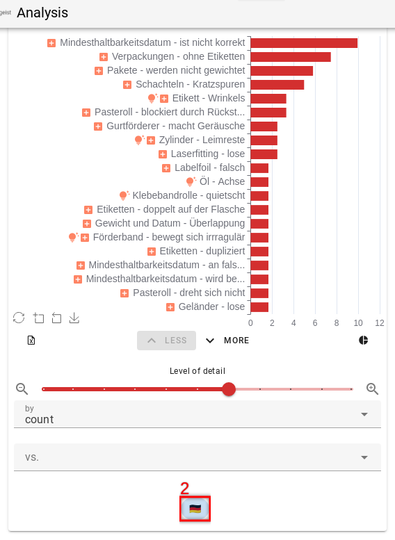
Pareto Charts can only be displayed in one language, so the desired language must be selected again.
The comments can be displayed in multiple languages.
Find maintenance tips (preventive maintenance)
In the automatic screening, you can see how big the potential is to reduce stops through preventive maintenance.
The concrete tips can be seen in the Pareto Charts.
To do this, choose as usual:
- Databucket
- Date range
- Filter fields: machine
Click "Load Charts"
Maintenance tips are mainly displayed on the 2nd Pareto (orange for actions).
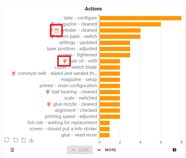
The Pareto shows all actions / repair measures.
A "lamp" indicates when the software has a maintenance tip.
NOTE: Settings > Data > "Maintenance tips" needs to be activated for this
You can hover over the group with the mouse to see more details.
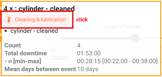
It shows which maintenance tip was found.
There are four different tips:
- Cleaning & Lubricating
- Consumables & Emptying
- Wear
- Calibration/Alignment
By clicking on the hint, you will be taken to a page with further explanations:
- How to recognize these problems
- How to prevent / reduce them
Regularity / Maintenance intervals
On the Pareto Charts, indicates when a regularity has been discovered. This is a strong indication of the systematics behind a problem.
This also makes it possible to see suitable maintenance intervals.
Eliminate recurring errors through root cause tips (Root Cause Analyse)
The second group of savings potentials are the causal clues for root cause analysis.
For this we use the Pareto Charts.
First, select the data:
- Databucket
- Date range
- Filter-fields: machine
Click «Load Charts»
The 1st Pareto chart (red problems) shows us the unplanned disruptions, sorted by frequency.
NOTE: Settings > Data > "Maintenance tips" needs to be activated for this
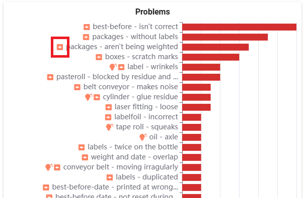
A sign indicates, that there are more details available.
Click on the problem group and select "SHOW DETAILS"
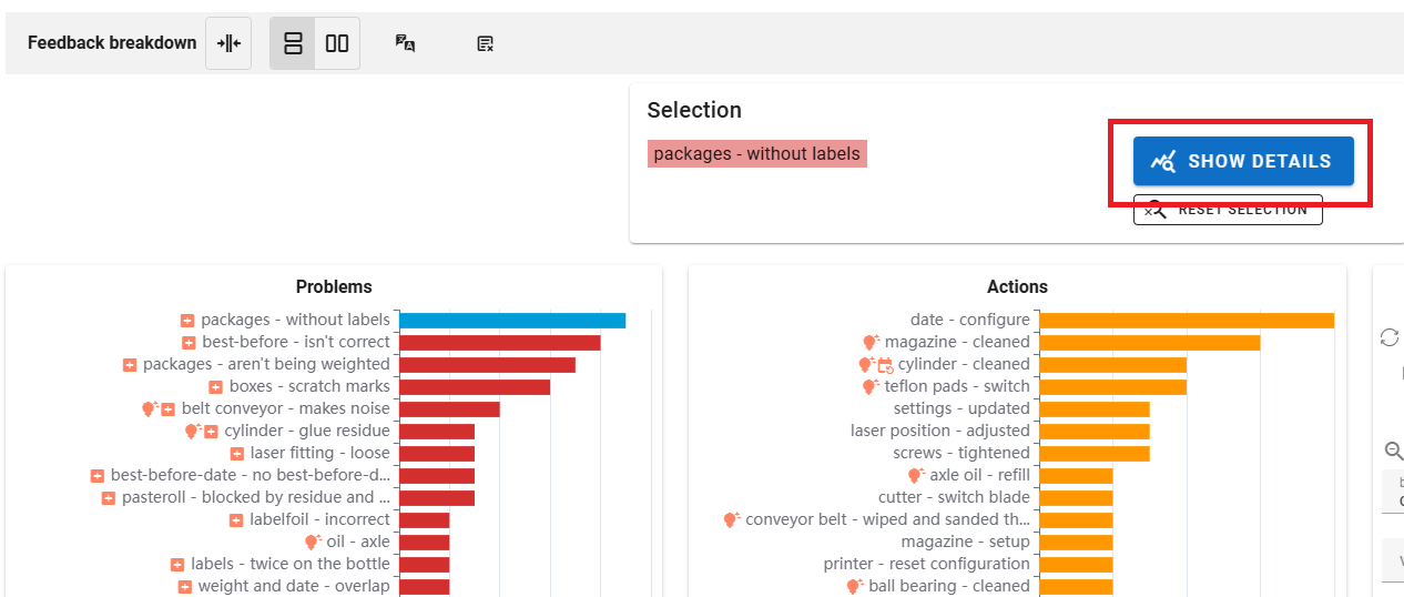
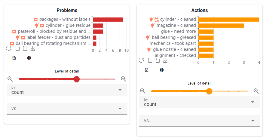
In the detail window, you can see the following information, which can give clues to the cause:
- Paretocharts focused on the selected problems
- Breakdown by any criteria
- Timeline / Regularity
- Comments (grouped or as a list)
Pareto charts
- Root cause notes - Orange Chart «Actions»: Here you can see troubleshooting steps for the problem. The fixes give an indication of what didn't work. These are good starting points for a 5-why analysis.Example: "Cleaning the roller" is the fix and the cause of the disturbance in the case of "dirty roller". Why was the roller dirty? Is it a training issue, is it not on the cleaning list? If the new glue drips more than before, ...
- Symptoms - Red chart «Problem»: shows other symptoms mentioned in connection with the problem.
Breakdown by...
Here you can see whether the error occurs specifically with a SKU/packaging or something else. This can help isolate the ground. For example, it always happens when packaging with the new film.

Timeline
- Switch between year/month/week/day to set the «Zoom Level»
- Use the date slider to select the date range of interest.
- It is quickly visually apparent whether the problem occurs regularly, or whether it is ev. clustered around a certain date. This can be helpful. Example: Ah it happens monthly, then it's always the monthly cleaning. Example: It has been appearing since January, haven't we changed the film supplier?

Comments grouped/listed:
- The button can be used to group the comments or display them as a list.
- "Grouped" groups similar messages together. Symptom combinations are thus quickly recognizable. Often there are several causes for the same problem.

These various clues can be discussed in the team meeting. The cues often help stimulate the memory of employees to get additional contextual information.
The solution is then either clear or a improvement initiative can be launched to collect missing information.
Further functions analysis
- Combine problems/actions: Sometimes it is helpful to combine the two groups and get a "combined" Paretochart. This is especially helpful when both issues/actions are not always captured.
- Split the screen horizontally / vertically.
- Language translation: The commentaries and Paretocharts can be translated into other languages. The translation is machine based. Select the language on the language picker. On the Pareto chart and on the comments themselves, the language must be selected again.
- Exclude words from analysis: Here you can define a "negative list" of words that should not be taken into account in the analysis. This is a remedy for emergencies. It is better to report any improvements to the support team.
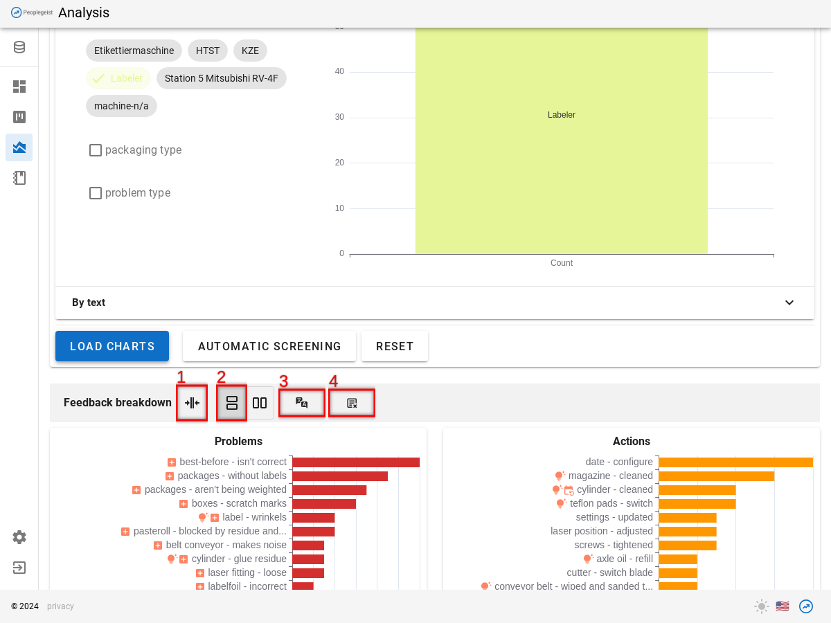
Report improvement: If text is not understood correctly by the AI, you can report this to support. The support looks at them regularly and tries to teach the AI this. It can take a while (4-5 weeks) for the AI to learn an improvement.
Extra info: The additional information can be displayed for each comment. These are all the fields that have been imported.